Canonical
on 26 August 2010
Hi guys I’m Andrea Cimitan! 😉
Sorry for the delay but here we are, with an abundance of updates for Ambiance and its complementary bright theme, Radiance!
It has been a great couple of weeks for me, where I continued working jointly with our visionary design lead Otto Greenslade, who I would like to thank for everything: working with him is really an exciting and valuable experience… he is fun, and the more I work with him, the more comfortable I feel and that means improving our productivity day-by-day.
We appreciate your feedback, all your comments, ideas and requests… and we used it as a base for the evolution of the theme. One of the things I love about the open source movement and our challenge is that is so easy for you to get in touch with us so that you feel how simple it is participating in the future of the whole product. That’s absolutely a peculiarity of the free software world, a characteristic closed software doesn’t have and definitely something we should be proud of.
Now let’s go back to the stuff we are all most interested in! 🙂
Ambiance
We highlighted few of the things you suggested, and worked hard to implement them while keeping an eye to the design and respecting our visual identity. Our goal is always to achieve the best compromise between overall look and usability.
- The text color: it is darker over the same background, resulting in more readability.
- The selected taskbar button: it is darker so it looks more distinctive among other inactive windows.
- The inactive menuitem color: now it stands out more over the background.
- Progressbar: is flatter, simply because we prefer it 😛
- Spinbutton: it is larger, so it’s more clickable and looks more consistent with the rest of the theme.
- Scale: look at the new sound menu to see how it is… cool, isn’t it? 🙂
- Treeview: elements inside the treeview are using a small radius (previously they were squared).
- Calendar: just a minor fix, especially for the indicator-datetime.
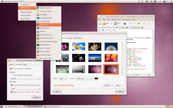
- IconBox: now Appearance Preferences’s selection looks sweet… 🙂
- Toolbar: has 1 pixel of padding.
- Window borders: the corners at the bottom are now squared, benefits for window dimensions, alignment of the statusbar and resize gripper, other things I have in mind like future dark themes (trust me).
Radiance!
Radiance shouldn’t feel like a different theme, but more like a brother/sister to Ambiance, exhibiting some brighter touches.
Dark theme
As someone of you may know, with Gtk+ 3.0 applications could check and load the dark variation of a theme. That was *exactly* the idea behind the dark theme you have seen previously. Since there are no applications currently using this feature (but there will be in the future, imagine shotwell, f-spot, gimp, totem, whatever) for the moment we concentrated our efforts on the other two themes, but I think that I will continue working on this in the future months and then include this dark variation for both of them.
We need you!
As I wrote above, let’s love the free gift open source gives us: communication!
In particular, we appreciate your feedback on these topics:
- Scrollbars: are they really too tiny? what is your experience?
- MenuItems: do you feel they are slow? (not in GIMP, which seems slow for a different reason)
- Radiance, Radiance, Radiance!
For anything else, we are here – so don’t wait another second before submitting your feelings, or to thank us if you are in love with the progress we’ve made so far…
Thank you guys for the attention, see you with the next update!


