Martin Wimpress
on 14 January 2020
Yaru is the user interface theme that has been used in Ubuntu since 18.10. The theme is what determines the colours, borders, shadows, size, and shape of individual elements on the screen.
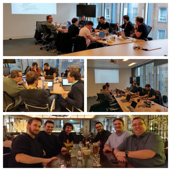
Last week, the Yaru team visited London to plan the future of Yaru with members of Canonical’s Design and Ubuntu Desktop teams. I’d like to thank Carlo, Frederik, Mads and Stuart for travelling across Europe to collaborate with us at the Canonical offices.
The face of Ubuntu Desktop
Since Ubuntu 18.10, Yaru has been the face of Ubuntu Desktop; the most popular Linux based desktop operating system. Changing the Ubuntu Desktop default theme requires careful consideration and the work created by the Yaru team isn’t just limited to Ubuntu.
Yaru is available for Fedora users and for Arch users, too. Last October, Pop! OS rebased their theme on Yaru. We’ve also had requests for Yaru variants that use the colours of Linux Mint, Manjaro and the Ubuntu flavours.
The importance of branding
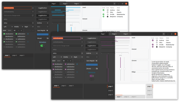
For most operating system vendors, having a distinctive look for the OS is important in establishing their brand. For example, one of the most obvious visual changes planned for Ubuntu 20.04 LTS is that check-boxes, radio buttons, and switches will change from green to Ubuntu aubergine. This will reduce the abundance of colours used overall, while still making it unmistakably Ubuntu.
Through our attendance at conferences such as GUADEC and Linux Application Summit, we’ve learned that some GNOME/GTK contributors develop using distributions other than Ubuntu. However, they want to ensure their applications render correctly for Ubuntu users without having to dual boot or maintain Ubuntu virtual machines. To help facilitate that, a community-contributed FlatPak of the Yaru theme will be made available to compliment the packages of Yaru already available in the Fedora archive and the Arch Linux AUR.
To further minimise the likelihood of inconsistent application presentation when using Yaru, the Yaru team more closely aligned with the upstream Adwaita theme last year. With the introduction of GitHub actions, the Yaru team are now automatically receiving each upstream Adwaita change as a pull request on the Yaru repo. This helps reduce the delta between the themes and enables the Yaru developers to stay current.
Light, dark, and in between
Ten years ago, Ubuntu 10.04 LTS — with its Radiance and Ambiance themes — popularised the choice of having lighter and darker variations of the same default theme.
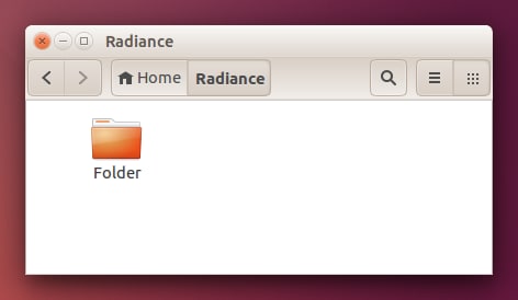
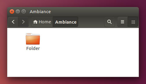
The original theme for GNOME 3.0, Adwaita, was designed with the intent that there would be one theme with no variations. Since then, however, macOS and Windows have adopted a similar approach to Ubuntu, with light and dark choices.
With Ubuntu 20.04 LTS, we plan to go one step further. As well as the dark variation, and the standard version with light controls and dark headers, we will be introducing a third variation that is light throughout. We also plan to reintroduce the ability to switch between these variations within ‘Settings’, for which we have design work in progress.
In future, we would also like these settings to switch the theme for shell elements, such as the top bar and notification bubbles. Achieving this without requiring a logout each time will require additional work in GNOME Shell – something we are investigating.
Folder icon exploration
We are experimenting with some alternative folder icons that aim to preserve the Ubuntu identity, while maintaining good contrast in both the light and dark variants of Yaru.
Easier contribution
We have also planned some activities to make it easier for potential new contributors to get involved with the Yaru project. This includes better documentation that describes the theme architecture, making the build system support alternative coloured variants which we will pre-populate with an alternative theme for each of the official Ubuntu flavours.
The Yaru team has also been regularly attending GNOME Design team meetings. Members of the Canonical Design and Desktop team will also join those meetings on a regular basis so we can better collaborate with upstream.
Not finished yet
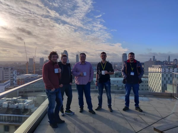
In between mugs of tea on the roof of the Canonical offices in London, we achieved a great deal during the design sprint. But, we’re not finished yet and have identified a number of areas for improvement we’ll be working on in the weeks ahead. I hope you’ve enjoyed this little look at what we’re working towards for Ubuntu 20.04.


