Anthony Dillon
on 25 June 2019
Design and Web team summary – 25 June 2019
This was a fairly busy two weeks for the Web & design team at Canonical. Here are some of the highlights of our completed work.
Web squad
Web is the squad that develop and maintain most of the brochure websites across the Canonical.
Getting started with AI webinar
We build a page to promote the AI webinar.

Legal page updates
There have been several minor changes to the legal pages on the site.
New telco whitepaper
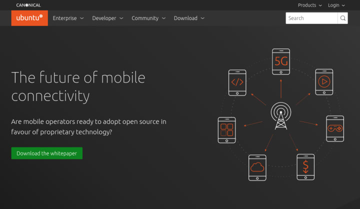
Designed and built a takeover and landing page for a whitepaper on telecommunications, featuring Lime Microsystems.

Moved blog.ubuntu.com to ubuntu.com
This was a collaborative effort between multiple squads in the team, which resulted in moving the blog from blog.ubuntu.com to ubuntu.com/blog. This is now live with redirects from the old links to the new home of blog.

Brand
Brand squad champion a consistent look and feel across all media from web to social to print and logos.
Marketing support
We completed a few documents for the Marketing team, datasheets and a whitepaper.
Suru exploration
We did some initial exploration work on how we can extend the use of Suru across the webs. We concentrated on use in the header and footer sections of bubble pages. The aim is to get consistent use across all our websites and guideline how it is to be used in order to help the development teams going forward.
Illustrations
We pushed on with the development of our illustrations, completing an audit of illustrations currently used across all our websites and putting a plan in place to update them in stages.
We designed an illustration for ‘The future of mobile connectivity’ to go in a takeover on Ubuntu.com
Iconography
Finalised a list of UI icons with the UX teams with a view to create a new complete set to go across all our products, delivering a consistent user experience.
Slide deck tutorial
We completed the first stage of a video tutorial to go alongside the Master slide deck that guides you on how to use the new deck, do’s and dont’s, and tips for creating great looking slides.
MAAS
The MAAS squad develop the UI for the maas project.
Understand network testing
As the engineers are starting to flesh out their part of the spec for network testing in MAAS – a new feature aimed at the 2.7 release, the UX team spent a significant amount of time learning and understanding what network testing implies and how it will work. We began creating initial sketches to help both the design and the engineering team think in line for what the UI could look like.
Upgrade to Vanilla 2.0
We upgraded the MAAS application to Vanilla 2.0, making use of all the great features introduced with it. As things the new version of the framework introduces quite a few changes, there are a number of issues in the MAAS UI need to be fixed – the work for this was started and will continue in the next iteration.
Implement small graphs for KVM listing
We are introducing new small graphs within a table, that will, to begin with, be used in the KVM and RSD pages, allowing the users to at-a-glance see their used and available resources. The work for this began with implementing graphs and infotips (rich tooltips) displaying storage and will continue in the next iteration with graphs displaying cores.
JAAS
The JAAS squad develops the UI for the JAAS store and Juju GUI projects.
Juju status project
We gathered which pieces of information would be good to display in the new Juju status project. The new GUI will help Juju to scale up, targeting users with lots of Juju/models, stitching all bootstrapping together. Status of all models with metadata about the controllers, analytics and stats. JAAS is the intersection of Juju, CLI, models and solutions.
Jaas.ai enhancements
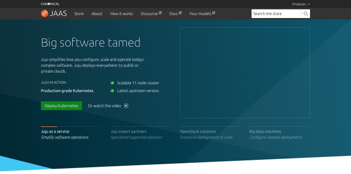
We have worked on an update to the homepage hero area to include a slideshow. This will help to promote different types of content at the homepage.

Vanilla
The Vanilla squad design and maintain the design system and Vanilla framework library. They ensure a consistent style throughout web assets.
Released Vanilla 2.0
Over the past year, we’ve been working hard to bring you the next release of Vanilla framework: version 2.0, our most stable release to date.

Since our last significant release, v1.8.0 back in July last year, we’ve been working hard to bring you new features, improve the framework and make it the most stable version we’ve released.
You can see the full list of new and updated changes in the framework in the full release notes . Alternatively you can read up on high-level highlights in our recent blog post New release: Vanilla framework 2.0, and to help with your upgrade to 2.0 we’ve written a step-by-step guide to help you along the way.
Site upgrades
With the release of Vanilla 2.0 we’ve been rolling upgrades across some of our marketing sites.
Snapcraft
The Snapcraft team work closely with the snap store team to develop and maintain the snap store website.
Distro pages
Upon our release of new pages with instructions to enable snap support to users, we got some echo in the media. Check these articles:
These pages are generating an aggregated traffic around ~2000 visits per day since they launched, they keep growing without having performed any specific campaign.
Release UI drag’n’drop
The Release UI has received some love this iteration. We’ve updated the visual style to improve usability and worked on drag’n’dropping channels and releases – which will be landing soon.
There was some refactoring needed to make the right components draggable, and we took the opportunity to experiment with React hooks. This work was the foundation for a better release experience and flexibility that we’ll be working on in the coming iteration.
Base squad
The base squad focus on improving the central infrastructure that help our team work effectively and our sites run efficiently
Key sites moved to Kubernetes hosting – and losing the www
We’ve been gradually moving our sites to be hosted within our newer Kubernetes-based infrastructure. This helps us deploy the sites faster and get better metrics and logging – all round helping us improve the sites faster.
This iteration, we moved ubuntu.com and canonical.com over, and we used the opportunity to remove the “www” prefix from both domains.
Some new Flask projects
For a long time we’ve based most of our websites on either Django or Flask. More recently, we moved to recommending Flask for sites that don’t need an SQL database back-end, and this iteration we made some moves towards solidifying this standard:
- We converted the maas.io project from Django to Flask
- We started a new Flask codebase which will ultimately replace the Django-based canonical.com
- We started another new Flask codebase which will replace certification.ubuntu.com, and move its management to our team so we can update its design in line with our other sites
Moving MAAS docs to Discourse
We’re in the process of migrating the MAAS docs from their old repository into a category in discourse.maas.io, ready to host them at maas.io/docs in the coming weeks.
Commercial applications
Responsive UI layout
The UI for the base application is now responsive and has been optimised for tablet and mobile devices. The work comprised of two components:
- Modifying the existing CSS Grid layout at certain breakpoints, which was relatively simple, and;
- Migrating the react-virtualized tables to react-window (a much leaner alternative for virtualized lists) and making them responsive. This piece of work was substantially more difficult.
Candid
Candid is our service which provides macaroon-based authentication.
Multi log-in, implementation of the design
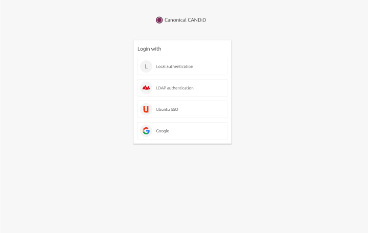
Candid has the ability to login to a selection of registered identity providers. We required an interface to select the provider you want to use to authenticate with. This task included applying Vanilla framework to the existing views with improvements on performance and maintainability.


